Appearance
实现 CSS 效果生成器 工具
分类:developer | 标签:CSS、阴影、渐变、前端 可视化调整 box-shadow 与渐变,实时预览并生成 CSS 代码
2.1 功能说明
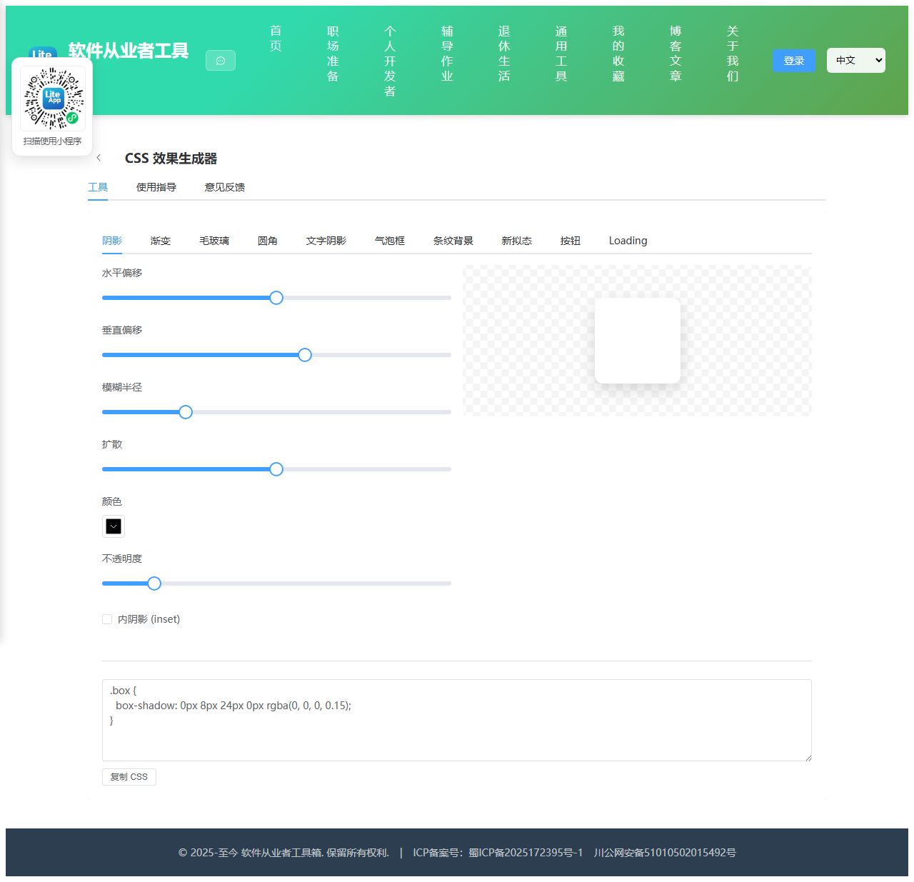
可视化调整 box-shadow 与渐变,实时预览并生成 CSS 代码
2.1.1 使用指南
使用指导
可视化调整各类 CSS 效果参数,实时预览并生成可直接复制的 CSS 代码,覆盖阴影、渐变、毛玻璃、圆角、文字阴影、气泡框、条纹、新拟态、按钮与 Loading 动画。
2.2 代码实现
2.2.1 组件结构
本工具是一个基于 Vue 3 <script setup> 语法的单文件组件(SFC),统一包裹在 ToolPageShell 组件内,由它提供页面标题、工具 ID、分类与「使用指南」插槽等通用外壳;核心业务逻辑(响应式状态、计算属性、事件处理函数)全部写在 <script setup> 中,输入/输出通过 el-input、el-button 等 Element Plus 组件与用户交互,所有数据均在浏览器本地处理,不会上传服务器。
2.2.2 核心逻辑概览
<script setup> 中定义的主要函数/方法:
hexToRgb()linkR()darken()bubbleCss()copyCss()
2.2.3 关键实现代码
以下是该工具的完整 <script setup> 实现(核心代码)。模板(<template>)与样式(<style>)已省略。
vue
import { ref, computed } from 'vue'
import { ElMessage } from 'element-plus'
import ToolPageShell from '@/components/ToolPageShell.vue'

const tab = ref('shadow')
const hexToRgb = (hex) => { const m = hex.replace('#', ''); return { r: parseInt(m.slice(0, 2), 16), g: parseInt(m.slice(2, 4), 16), b: parseInt(m.slice(4, 6), 16) } }

// 阴影
const sx = ref(0), sy = ref(8), blur = ref(24), spread = ref(0), scolor = ref('#000000'), salpha = ref(15), inset = ref(false)
const shadowCss = computed(() => {
  const a = (salpha.value / 100).toFixed(2)
  const c = hexToRgb(scolor.value)
  return `${inset.value ? 'inset ' : ''}${sx.value}px ${sy.value}px ${blur.value}px ${spread.value}px rgba(${c.r}, ${c.g}, ${c.b}, ${a})`
})

// 渐变
const gtype = ref('linear'), angle = ref(135), c1 = ref('#3883fa'), c2 = ref('#67c23a')
const gradCss = computed(() => gtype.value === 'linear' ? `linear-gradient(${angle.value}deg, ${c1.value}, ${c2.value})` : `radial-gradient(circle, ${c1.value}, ${c2.value})`)

// 毛玻璃
const gBg = ref('#3883fa'), gBgAlpha = ref(20), gBlur = ref(10), gRadius = ref(16), gBorder = ref(30)
const glassStyle = computed(() => {
  const c = hexToRgb(gBg.value)
  return {
    background: `rgba(${c.r}, ${c.g}, ${c.b}, ${(gBgAlpha.value / 100).toFixed(2)})`,
    backdropFilter: `blur(${gBlur.value}px)`,
    WebkitBackdropFilter: `blur(${gBlur.value}px)`,
    borderRadius: gRadius.value + 'px',
    border: `1px solid rgba(255,255,255, ${(gBorder.value / 100).toFixed(2)})`
  }
})

// 圆角
const rLink = ref(true), rTL = ref(12), rTR = ref(12), rBR = ref(12), rBL = ref(12)
function linkR(side) { if (!rLink.value) return; const v = { TL: rTL, TR: rTR, BR: rBR, BL: rBL }[side].value; rTL.value = rTR.value = rBR.value = rBL.value = v }
const radiusCss = computed(() => `${rTL.value}px ${rTR.value}px ${rBR.value}px ${rBL.value}px`)

// 文字阴影
const tsx = ref(2), tsy = ref(2), tblur = ref(4), tcolor = ref('#000000'), talpha = ref(60)
const textShadowCss = computed(() => {
  const c = hexToRgb(tcolor.value)
  return `${tsx.value}px ${tsy.value}px ${tblur.value}px rgba(${c.r}, ${c.g}, ${c.b}, ${(talpha.value / 100).toFixed(2)})`
})

// 气泡框
const bDir = ref('bottom'), bBg = ref('#303133'), bColor = ref('#ffffff'), bRadius = ref(8), bSize = ref(10)
const bubbleBoxStyle = computed(() => ({ background: bBg.value, color: bColor.value, borderRadius: bRadius.value + 'px' }))
const bubbleArrowStyle = computed(() => {
  const s = bSize.value, c = bBg.value
  const base = { width: '0', height: '0', position: 'absolute' }
  if (bDir.value === 'top') return { ...base, borderLeft: s + 'px solid transparent', borderRight: s + 'px solid transparent', borderBottom: s + 'px solid ' + c, top: -s + 'px', left: '20px' }
  if (bDir.value === 'bottom') return { ...base, borderLeft: s + 'px solid transparent', borderRight: s + 'px solid transparent', borderTop: s + 'px solid ' + c, bottom: -s + 'px', left: '20px' }
  if (bDir.value === 'left') return { ...base, borderTop: s + 'px solid transparent', borderBottom: s + 'px solid transparent', borderRight: s + 'px solid ' + c, left: -s + 'px', top: '50%', marginTop: -s + 'px' }
  return { ...base, borderTop: s + 'px solid transparent', borderBottom: s + 'px solid transparent', borderLeft: s + 'px solid ' + c, right: -s + 'px', top: '50%', marginTop: -s + 'px' }
})

// 条纹
const sColor1 = ref('#3883fa'), sColor2 = ref('#ffffff'), sAngle = ref(45), sWidth = ref(20)
const stripesCss = computed(() => `repeating-linear-gradient(${sAngle.value}deg, ${sColor1.value} 0, ${sColor1.value} ${sWidth.value}px, ${sColor2.value} ${sWidth.value}px, ${sColor2.value} ${sWidth.value * 2}px)`)

// 新拟态
const nBg = ref('#e0e5ec'), nRadius = ref(20), nDist = ref(10), nBlur = ref(20), nIntensity = ref(10)
const neuStyle = computed(() => {
  const c = hexToRgb(nBg.value)
  const d = nIntensity.value
  const light = `rgb(${Math.min(255, c.r + d)}, ${Math.min(255, c.g + d)}, ${Math.min(255, c.b + d)})`
  const dark = `rgb(${Math.max(0, c.r - d)}, ${Math.max(0, c.g - d)}, ${Math.max(0, c.b - d)})`
  return {
    background: nBg.value,
    borderRadius: nRadius.value + 'px',
    boxShadow: `${nDist.value}px ${nDist.value}px ${nBlur.value}px ${dark}, -${nDist.value}px -${nDist.value}px ${nBlur.value}px ${light}`
  }
})

// 按钮
const btnBg = ref('#3883fa'), btnColor = ref('#ffffff'), btnRadius = ref(8), btnPadX = ref(18), btnPadY = ref(9)
const darken = (hex, p) => { const c = hexToRgb(hex); const f = 1 - p / 100; return `rgb(${Math.round(c.r * f)}, ${Math.round(c.g * f)}, ${Math.round(c.b * f)})` }
const btnStyle = computed(() => ({ background: btnBg.value, color: btnColor.value, borderRadius: btnRadius.value + 'px', padding: `${btnPadY.value}px ${btnPadX.value}px`, border: 'none' }))
// 按钮 hover 仅作示意,复制代码里给出 :hover
const btnHover = computed(() => darken(btnBg.value, 12))

// Loading
const lType = ref('ring'), lColor = ref('#3883fa'), lSize = ref(40)
const loadingStyle = computed(() => ({
  width: lSize.value + 'px', height: lSize.value + 'px',
  border: `${Math.max(2, lSize.value / 10)}px solid rgba(0,0,0,0.1)`,
  borderTopColor: lColor.value, borderRadius: '50%', display: 'inline-block'
}))

const cssText = computed(() => {
  switch (tab.value) {
    case 'shadow': return `.box {\n  box-shadow: ${shadowCss.value};\n}`
    case 'gradient': return `.box {\n  background: ${gradCss.value};\n}`
    case 'glass': return `.glass {\n  background: ${glassStyle.value.background};\n  backdrop-filter: blur(${gBlur.value}px);\n  -webkit-backdrop-filter: blur(${gBlur.value}px);\n  border-radius: ${gRadius.value}px;\n  border: 1px solid rgba(255,255,255, ${(gBorder.value / 100).toFixed(2)});\n}`
    case 'radius': return `.box {\n  border-radius: ${radiusCss.value};\n}`
    case 'textshadow': return `.text {\n  text-shadow: ${textShadowCss.value};\n}`
    case 'bubble': return `.bubble {\n  position: relative;\n  background: ${bBg.value};\n  color: ${bColor.value};\n  border-radius: ${bRadius.value}px;\n  padding: 10px 14px;\n}\n.bubble::after {\n  content: '';\n  position: absolute;\n  ${bubbleCss()}\n}`
    case 'stripes': return `.stripes {\n  background: ${stripesCss.value};\n}`
    case 'neu': return `.neu {\n  background: ${nBg.value};\n  border-radius: ${nRadius.value}px;\n  box-shadow: ${neuStyle.value.boxShadow};\n}`
    case 'button': return `.btn {\n  background: ${btnBg.value};\n  color: ${btnColor.value};\n  border: none;\n  border-radius: ${btnRadius.value}px;\n  padding: ${btnPadY.value}px ${btnPadX.value}px;\n  cursor: pointer;\n}\n.btn:hover { background: ${btnHover.value}; }`
    case 'loading': return lType.value === 'ring'
      ? `.loader {\n  width: ${lSize.value}px;\n  height: ${lSize.value}px;\n  border: ${Math.max(2, lSize.value / 10)}px solid rgba(0,0,0,0.1);\n  border-top-color: ${lColor.value};\n  border-radius: 50%;\n  animation: spin 1s linear infinite;\n}\n@keyframes spin { to { transform: rotate(360deg); } }`
      : `.loader {\n  width: ${lSize.value / 4}px;\n  height: ${lSize.value / 4}px;\n  background: ${lColor.value};\n  border-radius: 50%;\n  animation: bounce 0.6s infinite alternate;\n}\n@keyframes bounce { to { transform: translateY(-${lSize.value / 3}px); } }`
    default: return ''
  }
})
function bubbleCss() {
  const s = bSize.value, c = bBg.value
  if (bDir.value === 'top') return `top: -${s}px; left: 20px;\n  border-left: ${s}px solid transparent;\n  border-right: ${s}px solid transparent;\n  border-bottom: ${s}px solid ${c};`
  if (bDir.value === 'bottom') return `bottom: -${s}px; left: 20px;\n  border-left: ${s}px solid transparent;\n  border-right: ${s}px solid transparent;\n  border-top: ${s}px solid ${c};`
  if (bDir.value === 'left') return `left: -${s}px; top: 50%; margin-top: -${s}px;\n  border-top: ${s}px solid transparent;\n  border-bottom: ${s}px solid transparent;\n  border-right: ${s}px solid ${c};`
  return `right: -${s}px; top: 50%; margin-top: -${s}px;\n  border-top: ${s}px solid transparent;\n  border-bottom: ${s}px solid transparent;\n  border-left: ${s}px solid ${c};`
}

function copyCss() {
  if (!cssText.value) return
  navigator.clipboard?.writeText(cssText.value).then(() => ElMessage.success('已复制 CSS'))
}
2.3 效果截图